Providing personalised & simplified IT services for Australian businesses through CloudFlow.
01
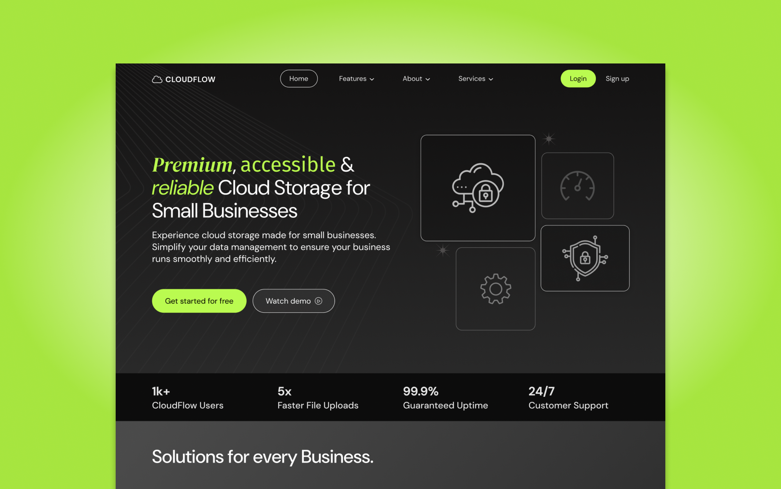
Starting point
CloudFlow had a clear vision for their brand, however, struggled to truly reflect their vision in the website’s UI. There were inconsistencies across the UI. The lack of definition between UI elements meant that the pages blended into one another, hindering its potential to convert users. CloudFlow had great offerings but key information appeared scattered throughout the pages with no clear user experience flow.
02
Objective
To reflect CloudFlow’s vision by enhancing UI elements and creating a distinct theme that guides users through the page and towards key calls to action. We aimed to create well-defined sections to streamline the user’s scrolling experience which would better communicate CloudFlow’s purpose, service offerings and benefits.

03
Outcome
CloudFlow’s branding is now clear and consistent throughout the website. The user experience is enhanced by the UI which increases the users’ trust in CloudFlow as the experience is consistent and engaging. By strategically using the secondary neon green, we were able to draw attention to main calls to actions to increase conversion.
The vision I had for my original website was captured very well by Marie. I struggled with the theme and styling of the website but I think my website stands out a lot more now and that users who browse the site are more likely to engage. Highly recommend.
Elijah M.